The Club gives itself a new logo
The Club’s website will be 30 years old in 2025. For reasons of security and of speed, to adapt to current browsing standards and terminals (laptops, smartphones…) that have much changed in that time and to make it more easily referenced by search engines, the CA has decided to renew it. A new site must appear this Spring 2025.
The remaking of the site was given to Nouvel Œil in Chambéry after a care evaluation of the offers received in response to our request.
The new website will have a contempory look with modern graphics, and so it seemed appropriate to update the Club logo at the same time.
The discussions have led, unanimously, to consider the idea of a new logo necessary for the following reasons :
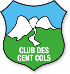
• the present logo lacks the most important element for a cycling club : the bike !
• the 30 year old logo no longer corresponds with current aesthetic criteria.
• a modern logo will help to revivify the Club’s image and will be more attractive to our potential members.
The commission working on the remaking of the website have made a long and deep study that has allowed the CA, at their meeting of 8 February 2025, to approve the new logo.
Important aspects that have been taken into account
Readability and clarity
The design of this logo is minimalist, which makes it immediately recognisable, even at a small size. The simple forms and clear colours make it easily read, whether it is on screen or printed on paper, textiles, or objects.
Adaptability to supports
This logo has been conceived for an optimal use on a great variety of supports : website, clothing, brochures, signs or even derived products like bottles or caps. Its uncluttered design allows accurate reproduction in monochrome, which is a major asset for economic or technical applications (stamps, engravings, etc.).
A durable visual identity
The logo was conceived then established on simple geometric forms and modern typography. These aesthetic choices give it a timelessness and aligns it with present and future graphic tendancies.
Usage for a logo and a strong sign
The logo is meant to serve as a part of our brand identity. Its simplicity makes it easily memorable for the public.
Coherence with the Club des Cent Cols
The Club des Cent Cols needs a logo that personifies the simplicity and elegance of cycling while remaining functional for a diverse audience. This logo fulfils this mission thanks to :
- Its modern appearance, to attract young cyclists while respecting the traditions of the Club
- A clear structure that puts forward the essence of our message (cycling and mountains).
The following elements, that characterise the Club des Cent Cols, werte identified :
The mountains with their cols
The cyclists with their bikes
A road leading to a col
It was decided to have two cyclists, one of each sex. Both wear helmets to remind us of the importance of safety on the bike.
To recognise her as she deserves, it was decided to place the woman in the foreground. She is easily recognisable by her ponytail.
Enrico Alberini
President of the Club des Cent Cols